Contributions to California’s Proposition 47

Social policies have always been tied to a deeply political process. This web of campaign contributions related to Proposition 47 in California was created by Len De Groot and Paige St. John. In 2014, the Los Angeles Times published an article describing how donors can influence public policy and law through charitable grants and direct financial contributions. Prop. 47 was designed to reduce criminal penalties for drug use and petty theft. Each of the five major donors (The California Endowment, Ford Foundation, Chuck Feeney, George Soros, and Roseburg Foundation) gave grants to organizations that then made financial donations to organizations who supported Prop. 47. The visualizations shows in red the direct campaign contributions and political advocacy in support of Prop. 47. The grey arrows show advocacy grants given and received by organizations as related to the five major contributors.

Interactive feature showing the grant amount, year, and purpose.

The goal of the visualization was to show how money could be travelled through multiple hands to support different campaigns. It accompanied a larger narrative article in the L.A. Times that described how charitable grants could be used to influence public policy since they are not reported the same way campaign contributions are. The audience of this visualization is Los Angeles Times readers and residents of California. Much like an investigation map often depicted on crime shows, the web of contributions directly shows the ways each organization supported Proposition 47.

Investigation mapping has become a common scene in television, as depicted above in AMC’s Breaking Bad.

The visualization shows the five major contributors on the outside, framing the inner web of grants, financial donations, and advocacy. The visualization is engaging and visually striking. At first glance, the reader can quickly gather a basic level of information. Since the visualization is interactive, readers can further their engagement with the information presented – finding out the year a grant was given or amount of the donation.

Visualization: “The Big Campaign: Prop 47 is part of larger push”

Article: “Prop. 47 puts state at center of a national push for sentencing reform”

Trump Wants a Border Wall. See What’s in Place Already.

The wall that President Trump wants between the United States and Mexico is a highly politicized topic. Perhaps that’s why NYT’s visualization has a neutral invitation as its title: “See what’s in place already.”

The visualization’s ideal audience are US citizens who are uninformed about the current border, from all types of political background. The facts stated that have no political leaning, such as the amount of federal land around the border, and the types of fences. This phrasing frames the visualization as unbiased, as an informant versus an influencer.

The visualization is scrolling, which allows the story to unfold before your eyes, and allows graphics to build on each other, such as adding the segments for fences but keeping the shading for land allocation. However, the scrolling feature also means that caption for the visualization can obstruct the view.

Shading and diagrams are selected carefully for effective representation, such as land, fencing, or specific locations. However, the visualization switches definitions for features, such as highlighting short fencing and tall fencing with the same color, which can result in confusion. Sources and dates for the data are often cited in the corners. Also integrated into the visualization are real-life pictures, which add credibility and emotional appeal.

While the visualization has its strengths and weaknesses, the overall neutral tone of the visualization, credibility of its data, easy to understand graphics, and the layman wording keeps the viewer’s attention through the whole visualization. These features help the visualization achieve its goal to educate its audience about the existing border protection between United States and Mexico.

Source: https://www.nytimes.com/interactive/2018/02/05/us/border-wall.html


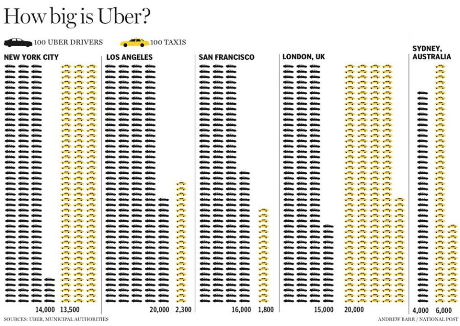
How big is Uber?


This visualization shows the size of Uber in comparison to taxis in five cities: New York, Los Angeles, San Francisco, London, and Sydney. In each case, the data is represented with car symbols: yellow for taxis and dark grey for Uber drivers.Every car in the picture represents 100 cars in reality. The information is presented in a very simple way, so the audience can be anyone reading the article or interested in the expansion of Uber company in the above mentioned cities or it can be a professional audience assessing the size of Uber in comparison to taxis (business or economic background).The goal of this representation is to visualize the size of Uber company in those cities and its share in the market  also it underlies the economic effect of Uber on taxi drivers.

This visualization conveys clearly the message about the effect Uber is having on transportation sector in several cities. The viewer can discern at first site if Uber has bigger, lower or equal share in the market than taxis and thus through the number of repeated symbols and the expansion of the colors without going into the detail of counting cars or even looking at the numbers.

https://smarttransitfuture.org/tag/efficient/

History of Crayola Colors

Link to original post by Stephen Wagner

This visualization shows data on all of the colors of crayons that Crayola has made since they began production in 1903, as well as if and when each color had been discontinued. I think the target audience of this visualization is made up of adults who might nostalgic for all of the fun colors (and color names) of Crayola crayons, and who might be curious to learn more about the history of colors that they remember using as a child as well as colors that were created before or after their time.

The goal of the presentation is to show the wide range of colors encompassed by Crayola crayons, and to give people a sense of what colors are younger or older, and how long certain colors have been around. Another goal is for the visualization to be interactive, allowing people to explore the colors and learn more about them one by one by clicking to reveal a larger color sample as well as more information about release date, retirement date, and any special collections that that color is a part of.

I think this visualization is effective in that it is fun to click around and learn more about the colors and their history, but organizationally it could be improved. The colors are not presented in an order that feels intuitive, and if you have a certain color in mind it is hard to find it in the mix of colors in order to click and learn more. It might have been good to include a zoom feature to zoom in on a certain section of the plot and/or reveal the names when just mousing over instead of having to click and let information load for each new color. It was also confusing to me why some colors were chosen to be available to be clicked in the Color Box on the left hand side while some needed to be found within the larger lined part of the visualization.

How your worst fears stack up against reality

Do you have any irrational fears? You might discover some after checking out this interactive visualization of common fears by Inga Ting, Mark Doman, Nathanael Scott, Alex Palmer, and Ri Liu for ABC News Australia. On the page, you are first presented with a grid of illustrations of common fears, from which you are told to select the three ways of dying you fear most (I chose falling, drowning, and fire).

Terrifying grid of fears/horrible ways to die

Once three fears are selected, the page automatically scrolls down and displays a bar chart of the three fears you chose, with length and a number representing how many people died of each cause between 2007 and 2016.

Deaths from my worst fears

As soon as you press a key or move the mouse, the page expands the bar chart to include the entire set of fears, so you can compare the three you chose (in peach) to the ones you didn’t (in gray).

Causes of death, ranked by number of deaths (turns out my fear of falling is totally legit)

The article goes on to explain the concept of irrational fears, why we have them, and why we tend not to have such an intense, visceral fear of things that would be more rational (such as skin cancer).

The visualization’s goal is to engage the reader with factual information about irrational fears in a way that is more personal and compelling than text alone, or even text and illustrations or photos. UX issues aside, requiring the reader to select their fears and then presenting their fears in comparison to the entire data set is effective for a few reasons:

  1. By making me select my biggest fears, the story becomes personalized to me and puts the facts in the context of things I care about
  2. The interaction requires me to imagine myself dying and to imagine my own experience of fear, which rouses emotions
  3. The data is presented in a simple, easy-to-understand format (bar chart) that clearly shows the point being made (how my fears compare to reality)

The actual set of data shown is also very small: the number of deaths in Australia from 2007-2016, grouped and sorted by cause of death, with only a selection of causes displayed. The sources of the data along with some clarifications are stated in a set of notes at the end of the story. The audience is the Australian public and some of the data is specific to that audience…for example, most Americans probably don’t think much about death by crocodile. But apparently I could stand to be a little more afraid of the sun.