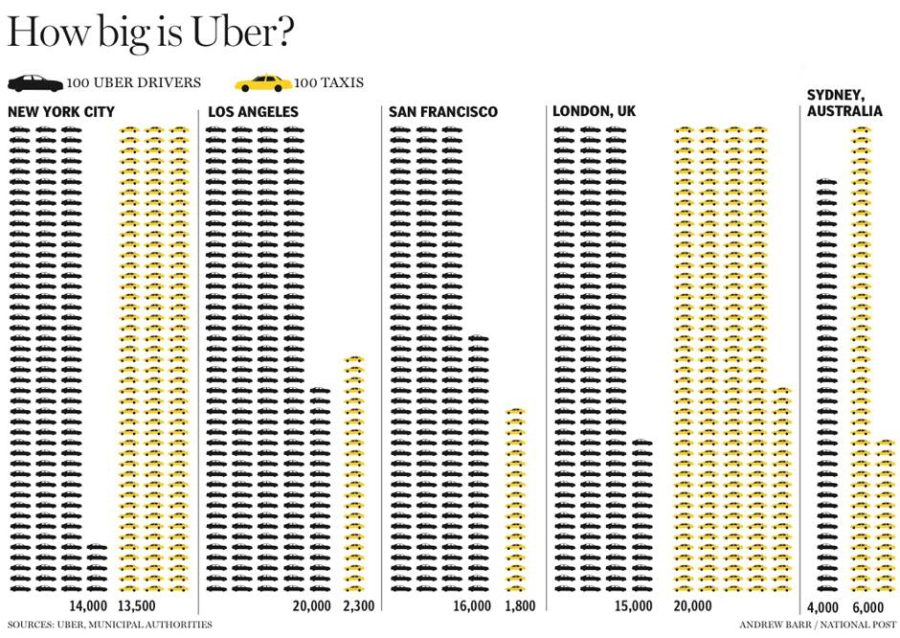
This visualization shows the size of Uber in comparison to taxis in five cities: New York, Los Angeles, San Francisco, London, and Sydney. In each case, the data is represented with car symbols: yellow for taxis and dark grey for Uber drivers.Every car in the picture represents 100 cars in reality. The information is presented in a very simple way, so the audience can be anyone reading the article or interested in the expansion of Uber company in the above mentioned cities or it can be a professional audience assessing the size of Uber in comparison to taxis (business or economic background).The goal of this representation is to visualize the size of Uber company in those cities and its share in the market also it underlies the economic effect of Uber on taxi drivers.
This visualization conveys clearly the message about the effect Uber is having on transportation sector in several cities. The viewer can discern at first site if Uber has bigger, lower or equal share in the market than taxis and thus through the number of repeated symbols and the expansion of the colors without going into the detail of counting cars or even looking at the numbers.