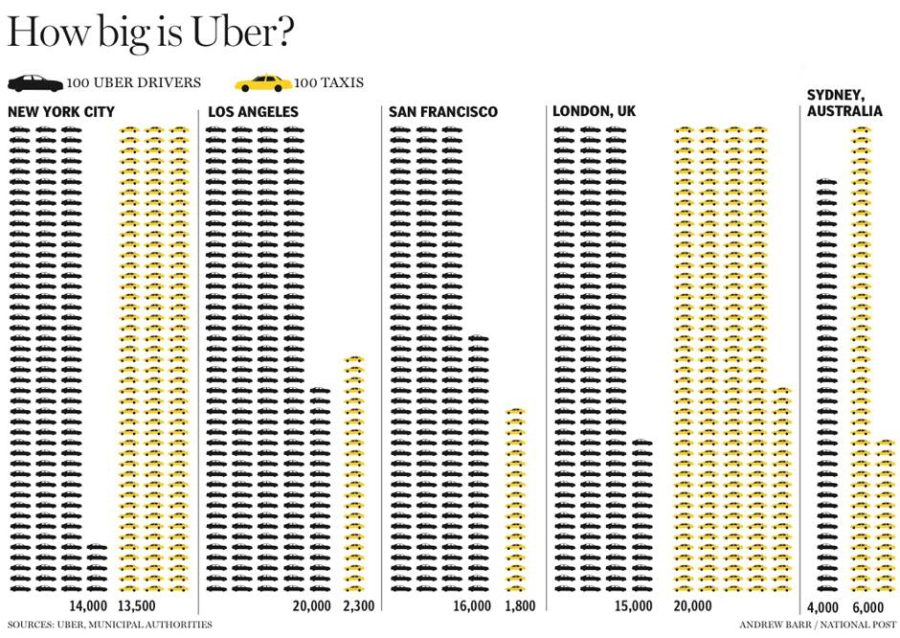
This visualization shows the size of Uber in comparison to taxis in five cities: New York, Los Angeles, San Francisco, London, and Sydney. In each case, the data is represented with car symbols: yellow for taxis and dark grey for Uber drivers.Every car in the picture represents 100 cars in reality. The information is presented in a very simple way, so the audience can be anyone reading the article or interested in the expansion of Uber company in the above mentioned cities or it can be a professional audience assessing the size of Uber in comparison to taxis (business or economic background).The goal of this representation is to visualize the size of Uber company in those cities and its share in the market also it underlies the economic effect of Uber on taxi drivers.
This visualization conveys clearly the message about the effect Uber is having on transportation sector in several cities. The viewer can discern at first site if Uber has bigger, lower or equal share in the market than taxis and thus through the number of repeated symbols and the expansion of the colors without going into the detail of counting cars or even looking at the numbers.
This visualization shows data on all of the colors of crayons that Crayola has made since they began production in 1903, as well as if and when each color had been discontinued. I think the target audience of this visualization is made up of adults who might nostalgic for all of the fun colors (and color names) of Crayola crayons, and who might be curious to learn more about the history of colors that they remember using as a child as well as colors that were created before or after their time.
The goal of the presentation is to show the wide range of colors encompassed by Crayola crayons, and to give people a sense of what colors are younger or older, and how long certain colors have been around. Another goal is for the visualization to be interactive, allowing people to explore the colors and learn more about them one by one by clicking to reveal a larger color sample as well as more information about release date, retirement date, and any special collections that that color is a part of.
I think this visualization is effective in that it is fun to click around and learn more about the colors and their history, but organizationally it could be improved. The colors are not presented in an order that feels intuitive, and if you have a certain color in mind it is hard to find it in the mix of colors in order to click and learn more. It might have been good to include a zoom feature to zoom in on a certain section of the plot and/or reveal the names when just mousing over instead of having to click and let information load for each new color. It was also confusing to me why some colors were chosen to be available to be clicked in the Color Box on the left hand side while some needed to be found within the larger lined part of the visualization.
Do you have any irrational fears? You might discover some after checking out this interactive visualization of common fears by Inga Ting, Mark Doman, Nathanael Scott, Alex Palmer, and Ri Liu for ABC News Australia. On the page, you are first presented with a grid of illustrations of common fears, from which you are told to select the three ways of dying you fear most (I chose falling, drowning, and fire).
Terrifying grid of fears/horrible ways to die
Once three fears are selected, the page automatically scrolls down and displays a bar chart of the three fears you chose, with length and a number representing how many people died of each cause between 2007 and 2016.
Deaths from my worst fears
As soon as you press a key or move the mouse, the page expands the bar chart to include the entire set of fears, so you can compare the three you chose (in peach) to the ones you didn’t (in gray).
Causes of death, ranked by number of deaths (turns out my fear of falling is totally legit)
The article goes on to explain the concept of irrational fears, why we have them, and why we tend not to have such an intense, visceral fear of things that would be more rational (such as skin cancer).
The visualization’s goal is to engage the reader with factual information about irrational fears in a way that is more personal and compelling than text alone, or even text and illustrations or photos. UX issues aside, requiring the reader to select their fears and then presenting their fears in comparison to the entire data set is effective for a few reasons:
By making me select my biggest fears, the story becomes personalized to me and puts the facts in the context of things I care about
The interaction requires me to imagine myself dying and to imagine my own experience of fear, which rouses emotions
The data is presented in a simple, easy-to-understand format (bar chart) that clearly shows the point being made (how my fears compare to reality)
The actual set of data shown is also very small: the number of deaths in Australia from 2007-2016, grouped and sorted by cause of death, with only a selection of causes displayed. The sources of the data along with some clarifications are stated in a set of notes at the end of the story. The audience is the Australian public and some of the data is specific to that audience…for example, most Americans probably don’t think much about death by crocodile. But apparently I could stand to be a little more afraid of the sun.
People often feel a connection to their community/town/region, manifesting itself most ostensibly in the support of a sports team. While the borders between cities, counties, and states are often arbitrary, social media lets us see how our allegiances truly lie around this country. This New York Times visualization shows which MLB teams have the greatest fraction of Facebook likes within a zip code. Aggregating the data literally paints an interesting picture, in some cases redrawing borderlines around the nation. The creators of this visualization overlay team colors onto the map, creating a heat map of allegiance to each team.
Created for the statistically-minded sports fan, this visualization attempts to show where each team has developed a following. The authors focus on the boundaries between rivals or metro areas, to support the hunches of baseball fans about where one team’s turf ends and another begins. Diving into the data, we can see how certain teams, such as the New York Yankees have expansive influence well into Connecticut, but surprisingly also around Las Vegas, North Carolina, and Montana. Oppositely, teams like the Oakland Athletics or New York Mets are unable to capture the zip code around their own stadium.
This is an effective visualization because it elaborates on an important question: what are the distinct regions of the US. The sample size for the data is large and the results both plausible and surprising. The graphic is relatively easy to read and guides the viewer to some of the interesting contrasts, like between the LA Angels and Dodgers or the Cleveland Indians and Cincinnati Reds. The flaw with this visualization is that it hides information that I would like to see. For example, the color shading doesn’t show anything about which team is 2nd most popular. While the percentage of supports for each team is provoking, it would be helpful to see how many supporters are recorded for each team, or at least the sample size for each zip code.
This visualization is aesthetically attractive, surprising, and also plausible enough to be credible. To take it to the next level I want to see more information overlaid about the 2nd place teams, how other sports compare, and how other measures of cultural influence interact with fan heat map for America’s favorite pastime.
This data presentation by the New York Times is a depiction of how much water California uses to grow various foods that are part of the American diet. The goal is to show how our consumption habits contribute to a drought in California and vice versa, how a drought in California can alter our eating habits. They also seem to want the reader do something about it, judging by their usage of “your” in their title “Your Contribution to the California Drought.”
They show California export and import data as well as agricultural data. Their target audience appears to be American consumers, perhaps more specifically whoever is stuck with the household chore of going to the grocery store. They show not only images of produce that California exports that require the most gallons of water to grow, but also ones that require the least. The images of foods coupled with the number of gallons of water required is simple, but very relatable. This simplistic depiction makes some of the data more shocking and surprising (i.e. that it takes 42.5 gallons to produce 3 mandarin oranges). Furthermore, showing the food as cut up or on a plate, instead of using some online graphic, makes the data easier to digest because it is how food is generally presented to us. However, they only have a quote about how the drought will cause consumers to pay more or switch to other products, which isn’t a very compelling call to action. It seems like there is another data story that they skimmed over with that quote, a story about how much food prices will go up etc. Overall, I think they are effective in conveying how the American diet contributes to the California drought, but does not do a great job explaining what one can do. I had a “so what?” feeling at the end.