Vitamin Bee
By Margaret Sands, Kunyi Li, Yihang Sui, and Rikhav Shah
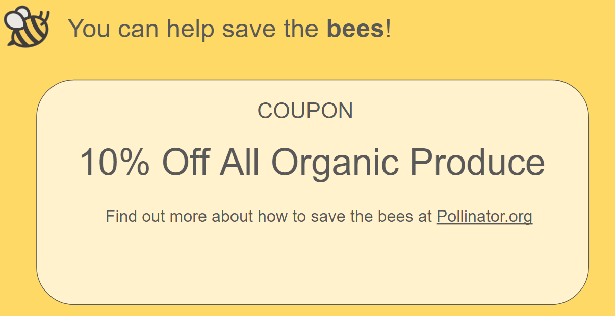
The data say that bee colonies are dying in large numbers across the United States due to various health stressors such as mites and pesticides. We want to tell this story because bees influence many parts of our daily lives without our knowledge. Many fruits and other crops rely on bees and other pollinators to create a larger and better quality harvest. However, most consumers of fruit do not consider the relationship. We want to inform grocery shoppers at supermarkets about the conditions of bee colonies in states that produce their favorite fruits and how widespread the problem is across the entire country, and urge them to take action to protect bees. Our audience is shoppers at supermarkets, possibly organic supermarkets like Whole Foods where customers would be more inclined to care about the environment. Our visualization is in the form of an interactive activity that would be displayed on a touch screen monitor or tablet along with a facilitator to guide the user through the experience. We incentivize grocery shoppers to participate in this activity by offering them a coupon on organic produce if they complete the activity.

The activity starts by prompting the user to pick their favorites in a list of fruits. The list of fruit is purposefully selected in that they are all fruits that rely on bee pollination. Then the user is presented with facts regarding the fruit that are also related to bees so they become aware that their favorite fruit is heavily tied to bees. For our example, the user has selected strawberries.
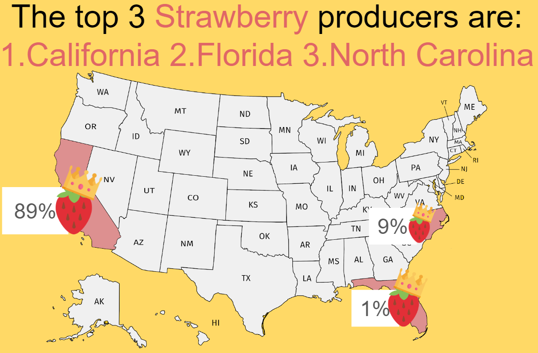
Next, the user is asked to guess which state they think produces the largest amount of their favorite fruit by dragging the fruit icon over a state. Once they’ve selected a state, we will reveal the 3 states that are the top producers of that fruit so the user can see if they guessed correctly.
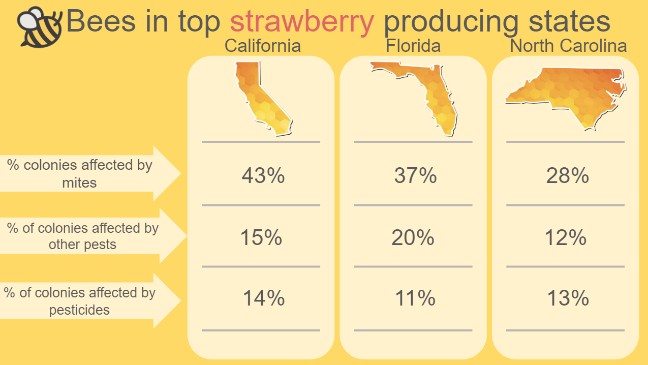
As we want to inform the user about bees in these states, we then present a side by side comparison of bee conditions in those three states. Stats included are bee population, annual percentage of bee colonies lost, and percentage of colonies affected by various health stressors.
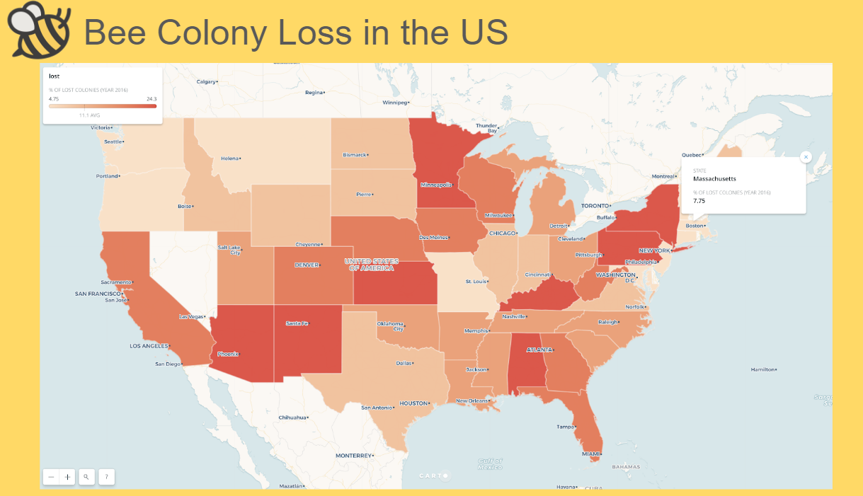
At this point, the user has only seen the problem of disappearing bees in three specific states, but we also want them to know that this problem is nationwide. To do this, we show them a map of bee colony loss in all the states across the country where they can select different states to see the percentage of annual bee colony loss in the selected state.
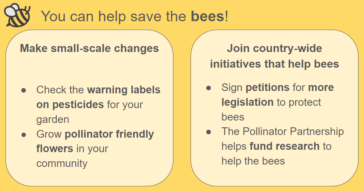
After they’ve seen the problem in the context of states and the entire US, we invite the user to create change. These invitations range from actions they can take in their own yard, like changing their pesticide of choice to a bee-friendly brand, to actions they can take in their own community, like helping plant a community garden, to actions they can take that can help bees across the country, like donating to research funds, calling their legislature, signing petitions, or even volunteering time to log information about local colonies for studies.
We think this will be an effective way to encourage shoppers to play a more active role in helping the bees. By having them pick their favorite fruit, the shopper is predisposed to care more about that fruit than a preselected one. Looking at individual states and how they compare emphasizes the problem of bee loss across the different states. Allowing the user to explore different the values across the United States outside of the spoon-fed data gives the experience a more personal feeling. If we had more time to iterate, we would focus on adding more data to the US map. Currently, the map focuses on only colony loss data. However, it could be augmented to add lower-level colony data or data relating to more fruits than what the user has currently selected.
Sources:
USDA data on fruit production
Pollinators.org
Bee pollination improves crop quality, shelf life and commercial value


